Flexbox in CSS
#iwritecode #learncodeonline #hiteshisawesome #fullstackjavascript


A Complete Guide to Flexbox
This blog is all about teaching you flexbox in CSS. Here I will be focusing on history of flexbox, then how to structure the parent elements using flexbox and I will also show you how to manipulate the positions of child elements using flexbox. After going through this comprehensive guide you can be sure that you have all skills related to flexbox.
For your reference I will also include the link of my code at the end of this article. I would highly recommend you to go through the code and replicate on your own once for making the flex concepts more stronger. At the end of this blog I will also give you a link to a game on flexbox which you can play for more practice.
What is flexbox?
The flexbox layout also known as Flexible-box is a module that was created and published in the year 2017. The main aim of flexbox was to provide more efficient way to make layouts for mobiles and desktop screens without writing tons and tons of lines of code in pure CSS. By using flexbox you can easily organize child elements inside parent elements and also all parent elements without worrying much about their height width and scales . Flexbox layout is direction agnostic as opposed to regular layout.
Note So people ask this question what should we use in our projects --> vanilla CSS, flexbox or grid ? My answer to all of them would to use all of them in the project because each one has it's own advantage.
For a video tutorial you can Click Here
Now the question arrives why should you learn flexbox if you know CSS or grid
Well there are lot of advantages of using flex and flexbox will achieve tasks very easily. Some of the most common advantages of using flexbox are listed below
- You can arrange elements as a row or a column
- You can arrange the spaces between , around the elements just by writing one line of code
- Any element can arranged in order
- Any elements position can be changed as per your need on the screen(either on X - axis or on Y - axis)
- You don't have to worry about the size of the elements while arranging them
Now let us take a look at some of the important flexbox concepts and terminologies
The below diagram show the most important concept of flexbox. If you understand this concept, you can confidently say you have understood 70% of the flexbox.
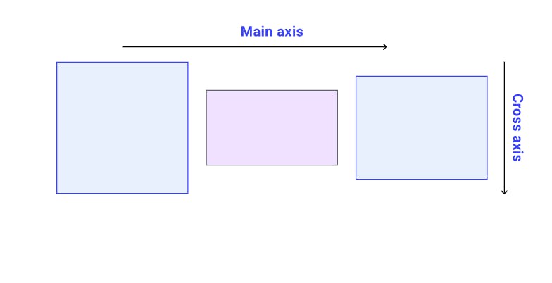
- In flexbox for websites the main axis is always horizontal line(or the X-axis). The verticle line(or the Y-axis ) is called the cross axis or other axis. This is the default axis, however you can also change it using the flex properties.
- In mobiles it is just the opposite.
Here is quick code tutorial for you to understand the properties
Steps to follow before writing the CSS code
- Create a index.html file as shown in the directory structure(Refer the code)
- Create a directory called CSS
- Inside it create a file called as style.css
- Now in the head portion of HTML file link the CSS file as show using link tag
- Include the HTML elements in the body of the HTML part
- Now start writing the CSS line by line
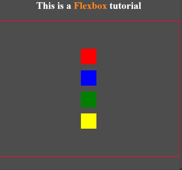
- This is what you will accomplish
If you follow ever step properly you will achieve as shown below
Here you will learn about four main properties:
- display: flex - makes the elements in the container arrange in row by default
- flex-direction - by default it's value is row. Here we have changed it to column
- justify-content - it acts on the main axis. When the flex direction is row, justify content works on row. When flex-direction is set to column, justify contents properties work on column. The default property values are
1. space-between 2. space-evenly 3. space-around 4. center 5. flex-start 6.flex-end - align-items - It acts on the other axis by default. The default property values are
                    1. space-between
                    2. space-evenly
                    3. space-around
                    4. center
                    5. flex-start
                    6.flex-end
Now try this code
<!DOCTYPE html>
<html lang="en">
  <head>
    <meta charset="UTF-8" />
    <meta name="viewport" content="width=device-width, initial-scale=1.0" />
    <meta http-equiv="X-UA-Compatible" content="ie=edge" />
    <title>Flexbox</title>
    <link rel="stylesheet" href="./css/style.css" />
  </head>
  <body>
    <h1 class="title">This is a <span>Flexbox</span> tutorial</h1>
    <div class="outer-box">
      <div class="boxes red-b"></div>
      <div class="boxes blue-b"></div>
      <div class="boxes green-b"></div>
      <div class="boxes yellow-b"></div>
      <div class="circles red-c"></div>
      <div class="circles blue-c"></div>
      <div class="circles yellow-c"></div>
      <div class="circles green-c"></div>
    </div>
  </body>
</html>
CSS code
* {
  margin: 0;
  padding: 0;
  box-sizing: border-box;
}

body {
  background-color: #4d4d4d;
  color: #ffffff;
  text-align: center;
}

span {
  color: #ff8a15;
}

.outer-box {
  border: 3px solid #dc143c;
  height: 80vh;
  margin-top: 30px;
  display: flex;
  flex-direction: column;
  align-items: center;
  justify-content: center;
}

/* These form the traingles */
.boxes {
  background-color: #fff;
  height: 50px;
  width: 50px;
  border: 2pz solid #000000;
  margin: 10px 10px;
}

.red-b {
  background-color: #ff0000;
}

.blue-b {
  background-color: #0000ff;
}

.green-b {
  background-color: #008000;
}

.yellow-b {
  background-color: #ffff00;
}
/* Thes form the circles */
/* .circles {
  height: 50px;
  width: 50px;
  border-radius: 30px;
  color: #ffffff;
  margin-top: 100px;
}

.red-c {
}

.blue-c {
}

.yellow-c {
}

.green-c {
} */
Let's move on to new property that is Order property
- order --> In order property you assign negative and positive values to assign a specific position to the item. If the value id negative the items moves left. if the value is positive the item moves right.
Let's try the code below.
Steps to follow before writing the CSS code
- Create a index.html file as shown in the directory structure(Refer the code)
- Create a directory called CSS
- Inside it create a file called as style.css
- Now in the head portion of HTML file link the CSS file as show using link tag
- Include the HTML elements in the body of the HTML part
- Now start writing the CSS line by line
- This is what you will accomplish
If you follow ever step properly you will achieve as shown below
The code for the following is below
<!DOCTYPE html>
<html lang="en">
  <head>
    <meta charset="UTF-8" />
    <meta name="viewport" content="width=device-width, initial-scale=1.0" />
    <meta http-equiv="X-UA-Compatible" content="ie=edge" />
    <title>Flexbox</title>
    <link rel="stylesheet" href="./css/style.css" />
  </head>
  <body>
    <h1 class="title">This is a <span>Flexbox</span> tutorial</h1>
    <div class="outer-box">
      <div class="boxes-b">
        <div class="boxes red-b"></div>
        <div class="boxes blue-b"></div>
        <div class="boxes green-b"></div>
        <div class="boxes yellow-b"></div>
      </div>
      <div class="circles-c">
        <div class="circles red-c"></div>
        <div class="circles blue-c"></div>
        <div class="circles yellow-c"></div>
        <div class="circles green-c"></div>
      </div>
    </div>
  </body>
</html>
CSS code for the following
* {
  margin: 0;
  padding: 0;
  box-sizing: border-box;
}

body {
  background-color: #4d4d4d;
  color: #ffffff;
  text-align: center;
}

span {
  color: #ff8a15;
}

/* These form the traingles */
.boxes-b {
  border: 2px solid white;
  width: 400px;
  height: 400px;
  display: flex;
  align-items: center;
  justify-content: space-around;
}
.boxes {
  background-color: #fff;
  height: 50px;
  width: 50px;
  border: 2pz solid #000000;
  margin: 10px 10px;
}

.red-b {
  background-color: #ff0000;
  order: 1;
}

.blue-b {
  background-color: #0000ff;
  order: -3;
}

.green-b {
  background-color: #008000;
  order: -1;
}

.yellow-b {
  background-color: #ffff00;
}
/* Thes form the circles */

.circles-c {
  border: 2px solid white;
  width: 400px;
  height: 400px;
  margin-top: 10px;
  display: flex;
  align-items: flex-start;
  justify-content: space-between;
}
.circles {
  height: 50px;
  width: 50px;
  border-radius: 30px;
  color: #24a354;
  border: 2px solid white;
  margin: 10px 10px;
}

.red-c {
  background-color: red;
  order: 1;
}

.blue-c {
  background-color: blue;
  order: -3;
}

.yellow-c {
  background-color: yellow;
}

.green-c {
  background-color: green;
  order: -1;
}
Here is a link to all the code that is shown here code-Sandbox
So this is a short tutorial on flexbox which has built a strong foundation for you. I hoped you enjoyed it.
You can also play this fun flexbox game FLEXBOX FROGGY. This will also help you understand more about flexbox.
For more Click Here
Happy Coding :)