CSS Grid - Learning made easier
#iwritecode #learncodeonline #fullstackjavascript #design #responsiveness
CSS Grid Introduction
Grid system is a modern CSS technique to create beautiful layouts with minimal effort. It is one of the brand new module of CSS and it's two dimensional in nature(by this I mean here you have a X-axis and a Y-axis to play around with). Personally I feel if you know flex and you want to learn GRID you will pick it up in less time as some properties and values of Flex and Grid are both same. Having said that I would also like to bring to your attention that I have seen many developers ho only works with FLEX or GRID to achieve what they want. Functionality wise GRID serves more and I feel if you learn both flex and Grid you can make anything using CSS very very easily. In this article I will walk you through the basics of GRID. Incase you are interested in learning Flex you can Click Here
Advantages of GRID system
- CSS Grid replaces float layouts.
- CSS Grid is a two-dimensional system(both rows and columns are in your grasp) where as Flexbox is one-dimensional.
- CSS Grid works perfectly with Flexbox, so you can design awesome components and layouts.
- With CSS GRID you can wrote less and more readable CSS.
- Speeds up development process.
- It also helps in responsiveness.
- Grid allows you to minimize using libraries like Bootstrap
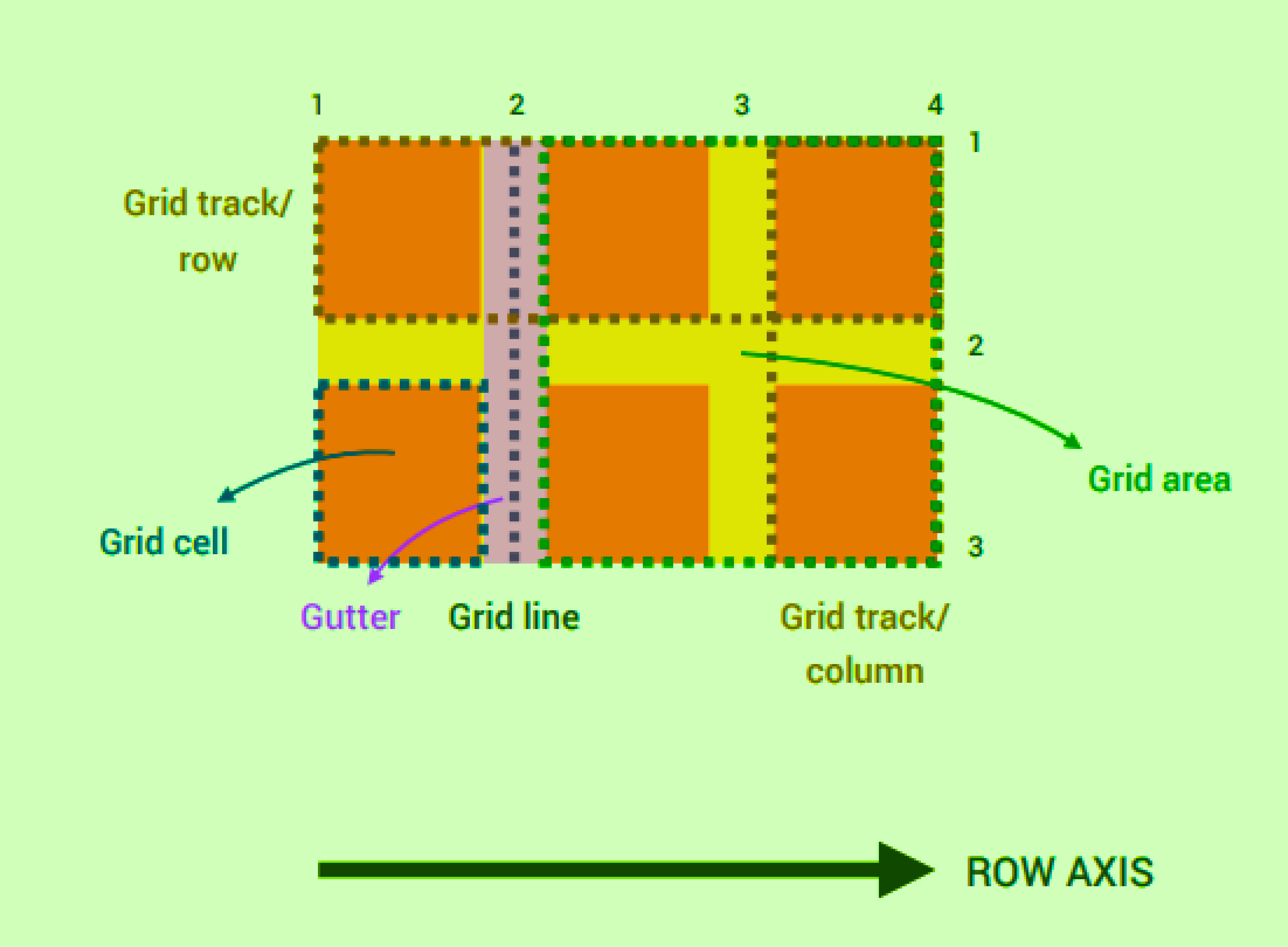
Now let's understand some of the important GRID terminologies

Key points to remember from this diagram
- We have a row axis(in x direction) and a column axis(in y direction). In grid you cannot change the axis just like you change axis in flexbox. The axes are always fixed and the same.
- The horizontal and vertical lines that divide the rows and columns are called the grid lines. The grid lines are always numbered. If you have 'n' number of rows the grid line count for row is n+1. If you have 'm' number of columns the grid line count for columns is n+1.
- The spaces between rows and columns are called the row gutter and column gutter respectively
- The space between two grid lines is called a track.
- The area between two horizontal and vertical grid lines is called a grid area(end to end)
- The area enclosed like a box inside two horizontal grid lines and two horizontal column lines is called a GRID cell.
GRID properties to remember
Container Level
- grid-template
- grid-template-rows
- grid-template-columns
- grid template-areas
- grid-gap -grid-row-gap -grid-column-gap
- justify-items
- align-items
- justify-content
- align-content
- grid-auto-rows
- grid-auto-columns
- grid-auto-flow
Item Level
grid-area
- grid-row
    - grid-row-start
    - grid-row-end
- grid-column
     - grid-column-start
     - grid-column-end
justify-self
- align-self
- order
Note: Always remember whenever you use a property value in an item , the grid property on the container for that item is overwritten
Here is quick code tutorial for you to understand the properties. And if you promise to stick around till the end I will provide you with a GRID game link which will make your learning more fun and clear all you concepts.
Steps to follow before writing the CSS code
- Create a index.html file as shown in the directory structure(Refer the code)
- Create a directory called CSS
- Inside it create a file called as style.css
- Now in the head portion of HTML file link the CSS file as show using link tag
- Include the HTML elements in the body of the HTML part
- Now start writing the CSS line by line
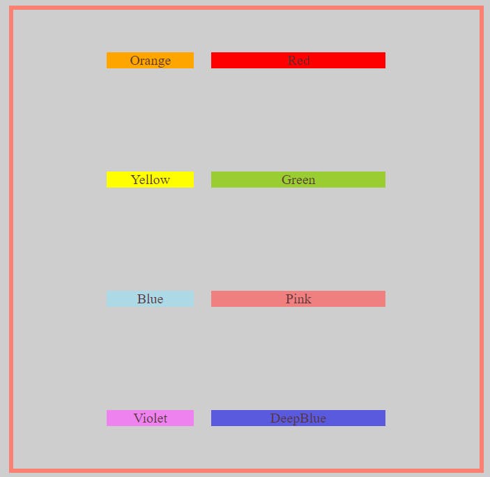
- This is what you will accomplish
- I will provide all of my code link at the end.
If you follow ever step properly you will achieve as shown below

First let's cover-up Container level properties. Here is the code
  <!DOCTYPE html>
<html lang="en">
  <head>
    <meta charset="UTF-8" />
    <meta name="viewport" content="width=device-width, initial-scale=1.0" />
    <meta http-equiv="X-UA-Compatible" content="ie=edge" />
    <title>Grid Tutorial</title>
    <link rel="stylesheet" href="./css/style.css" />
  </head>
  <body>
    <div class="container">
      <div class="items item1">Orange</div>
      <div class="items item2">Red</div>
      <div class="items item3">Yellow</div>
      <div class="items item4">Green</div>
      <div class="items item5">Blue</div>
      <div class="items item6">Pink</div>
      <div class="items item7">Violet</div>
      <div class="items item8">DeepBlue</div>
    </div>
  </body>
</html>
Now write this CSS code after carefully reading the comments mentioned. The comments explains everything you need to understand
body {
  background-color: #cecece;
  color: #573232ee;
}

/* giving a border and height with to container */
.container {
  border: 5px solid #fa8072;
  margin: 10px;
  height: 95vh;
  width: 90vw;
  /*grid view is activated like this*/
  display: grid;
  /* makes grid rows --> here I made 4 rows of 100px each */
  grid-template-rows: 100px 100px 100px 100px;
  /* you can also declare rows like this */
  /* grid-template-rows: repeat(4, 100px); */
  /* grid-template-rows: repeat(2, 100px) 100px 100px; */
  /* makes grid columns --> here I made 2 columns */
  grid-template-columns: 100px 200px;
  /* gives gap to grid column and rows */
  /* grid-gap: 20px; */
  /* orelse you can do gapping like below */
  grid-row-gap: 20px;
  grid-column-gap: 20px;
  /* justify works horizontally i.e. on x axis */
  justify-content: center;
  /* align always works in the y axis or vertically */
  align-content: space-around;
  /* There are many other property value for them. Please check the docs  */
  /* justify and align items applies values on individual items at once */
  align-items: center;
}
/* aligning texts to center */
.items {
  text-align: center;
}
.item1 {
  background-color: #ffa500;
}

.item2 {
  background-color: #ff0000;
}

.item3 {
  background-color: #ffff00;
}
.item4 {
  background-color: #9acd32;
}
.item5 {
  background-color: #add8e6;
}
.item6 {
  background-color: #f08080;
}
.item7 {
  background-color: #ee82ee;
}
.item8 {
  background-color: #5a5adf;
}
Click on this to get direct access to the code ---> Container Level Code Link
Now that you understood container level properties, let's cover-up item level properties.
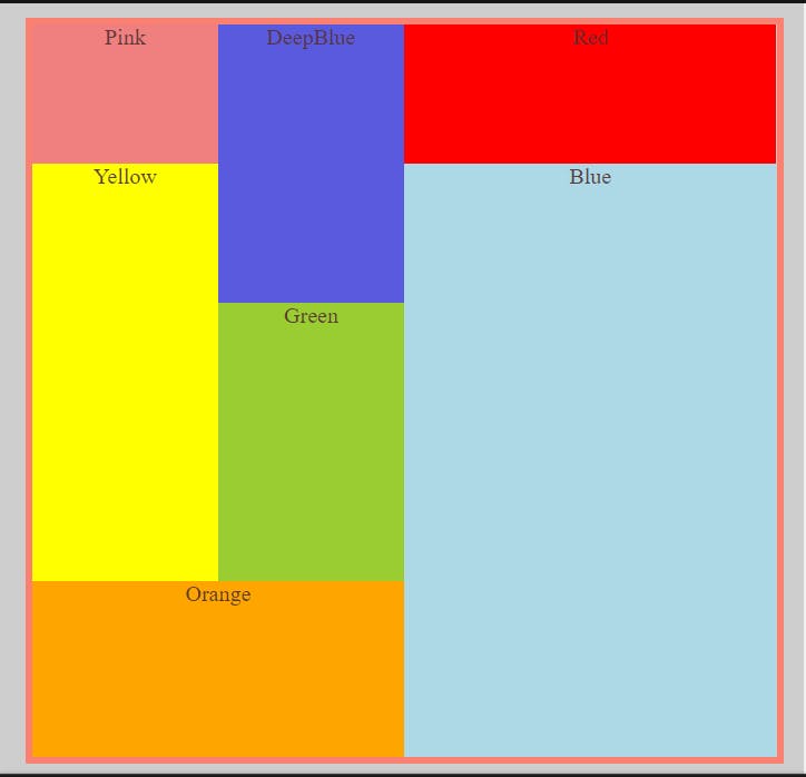
If you follow ever step properly you will achieve as shown below

We will focus on these properties:
- Order - It's value changes the position of the individual items. Giving positive value will shift the item to end, and giving negative value will shift the item to front with respective to it's natural order. (By default all items order is set to 0)
- What we will do in the code using order property - we change the order of orange box to last position - we bring the pink box to first position - we bring the deep blue box to second position - Spanning Across rows and columns using grid-row-start, grid-row-end, grid-row,
grid-column-start, grid-column-end, grid-column, grid-area.
We will use gridlines to position the items. The grid lines can be seen if you inspect the parent container in any browser(I would recommend to use morzilla firefox)
     - What we will do in the code using order property
           - we span the orange box from gridline 4 upto  grid-line 5 for row. And in column
                from grid-line 1 upto  grid-line 3
           - we span the blue box (gridlines concept used)
           - we span the green box (gridlines concept used)
           - we span the deepblue box  (gridlines concept used)
            - we span the yellow box  (gridlines concept used)
Here is the code.
<!DOCTYPE html>
<html lang="en">
  <head>
    <meta charset="UTF-8" />
    <meta name="viewport" content="width=device-width, initial-scale=1.0" />
    <meta http-equiv="X-UA-Compatible" content="ie=edge" />
    <title>Grid Tutorial</title>
    <link rel="stylesheet" href="./css/style.css" />
  </head>
  <body>
    <div class="container">
      <div class="items item1">Orange</div>
      <div class="items item2">Red</div>
      <div class="items item3">Yellow</div>
      <div class="items item4">Green</div>
      <div class="items item5">Blue</div>
      <div class="items item6">Pink</div>
      <div class="items item8">DeepBlue</div>
    </div>
  </body>
</html>
Now write this CSS code after carefully reading the comments mentioned. The comments explains everything you need to understand
    body {
  background-color: #cecece;
  color: #573232ee;
}

/* giving a border and height with to container */
.container {
  border: 5px solid #fa8072;
  margin: 10px;
  height: 95vh;
  width: 90vw;
  /*grid view is activated like this*/
  display: grid;
  /* The below makes 4 rows , 2 rows--> 100px 1row--> 200px; 1row --> 1fr*/
  grid-template-rows: repeat(2, 100px) 200px 1fr;
  /* creates 3 columns, 2 cols --> 1fr 1col --> 2fr */
  grid-template-columns: 1fr 1fr 2fr;
}
/* aligning texts to center */
.items {
  text-align: center;
}
.item1 {
  background-color: #ffa500;
  /* brought orange to end */
  order: 1;
  /* spanning accoss  rows*/
  /* grid-row-start: 4;
  grid-row-end: 5; */
  /* you can achieve the above using grid-row.Lets see */
  /* grid-row:start-grid-line-number/end-grid-line-number */
  grid-row: 4/5;
  /* spanning across columns */
  grid-column-start: 1;
  grid-column-end: 3;
}

.item2 {
  background-color: #ff0000;
}

.item3 {
  background-color: #ffff00;
  /* spanning rows */
  grid-row: 2/4;
  /* spanning columns */
  grid-column: 1/2;
}
.item4 {
  background-color: #9acd32;
  /* spanning rows */
  grid-row: 3/4;
  /* spanning columns */
  grid-column: 2/3;
}
.item5 {
  background-color: #add8e6;
  /* spanning across row using grid line number*/
  grid-row: 2/5;
  /* spanning across column using grid line number*/
  grid-column: 3/4;
}
.item6 {
  /* sets the position of the element to first position
   */
  order: -2;
  background-color: #f08080;
}
.item7 {
  background-color: #ee82ee;
}
.item8 {
  background-color: #5a5adf;
  /* sets the item to second position --> also check the order of pink box */
  order: -1;
  /* grid-area:start-grid-line-number(row)/start-grid-line-number(column)/end-grid-line-number(row)/end-grid-line-number(column) */
  grid-area: 1/2/3/3;
}
Click on this to get direct access to the code ---> Item Level Code Link
This is it you have made it till the end but this does not show you all. First of all congratulations you have come a long way in learning CSS Grid. Apart from this personally I would recommend you to study more about GRID , specially these three more property values max-content, min-content,minmax. You can study more on GRID from HERE
As per promise here is the link to a game which used GRID. Go ahead and take a look Click Me
Hope you enjoyed the article. Happy Coding. Keep Smiling :)
